
Concept Redesign
UX Research
Visual Design
2 weeks (2025)
Timeline:
My Role:
UX Designer Researcher
Midterm Project
type:
Tools:
Figma Miro Notion
Project Background
The Roku app transforms your mobile device into a central hub for controlling Roku TVs and managing your streaming platforms, functioning as both a remote control and a tool for discovering movies and TV shows.
Problem Statement
Although over 89 million people use Roku, only about 5 million use its mobile app, highlighting major usability issues, as users don’t see value in downloading the app. Roku users often face friction navigating content and managing their streaming through the mobile app. The platform-specific browsing, limited horizontal layout, and lack of intuitive remote controls make discovering and controlling content inefficient and frustrating. Redesigning the app could enhance usability and perceived value, encouraging more Roku users to adopt it as an essential part of their streaming experience.

My Process
User Research
To understand how people actually use the Roku app in their day-to-day lives, I conducted 3 user interviews and 3 usability studies. The interviews focused on uncovering habits, frustrations, and unmet needs.
User Response Analysis
The app feels like a backup, not a primary tool Most users didn't see the app as essential to their experience: the physical remote felt more intuitive and familiar.
"I am not sure why I even have the app on my phone, the remote is fine." "The physical remote is easier to use, I don't understand the buttons on the app."
Search and filtering is broken Users consistently bypassed Roku entirely and went straight to individual platforms because the app couldn't narrow results by subscription or content type.
"It takes too much time to look for only Hulu or Netflix movies because I can't filter to just those two, I just search directly on Hulu or Netflix instead." "It gives me movies and TV shows, I want to search for just movies." "I would use the Roku app more if it allowed me to narrow my search."
Users can't make confident viewing decisions Without ratings or reviews in the app, users either left to research elsewhere or ended up watching something they regretted.
"I have picked and watched a movie that was really bad. I was too lazy to look up reviews online." "I click on a movie then check which platform I can watch it on, but it's not a subscription I own."
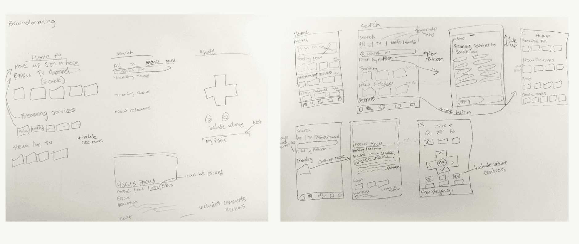
Brainstorming
Sketches
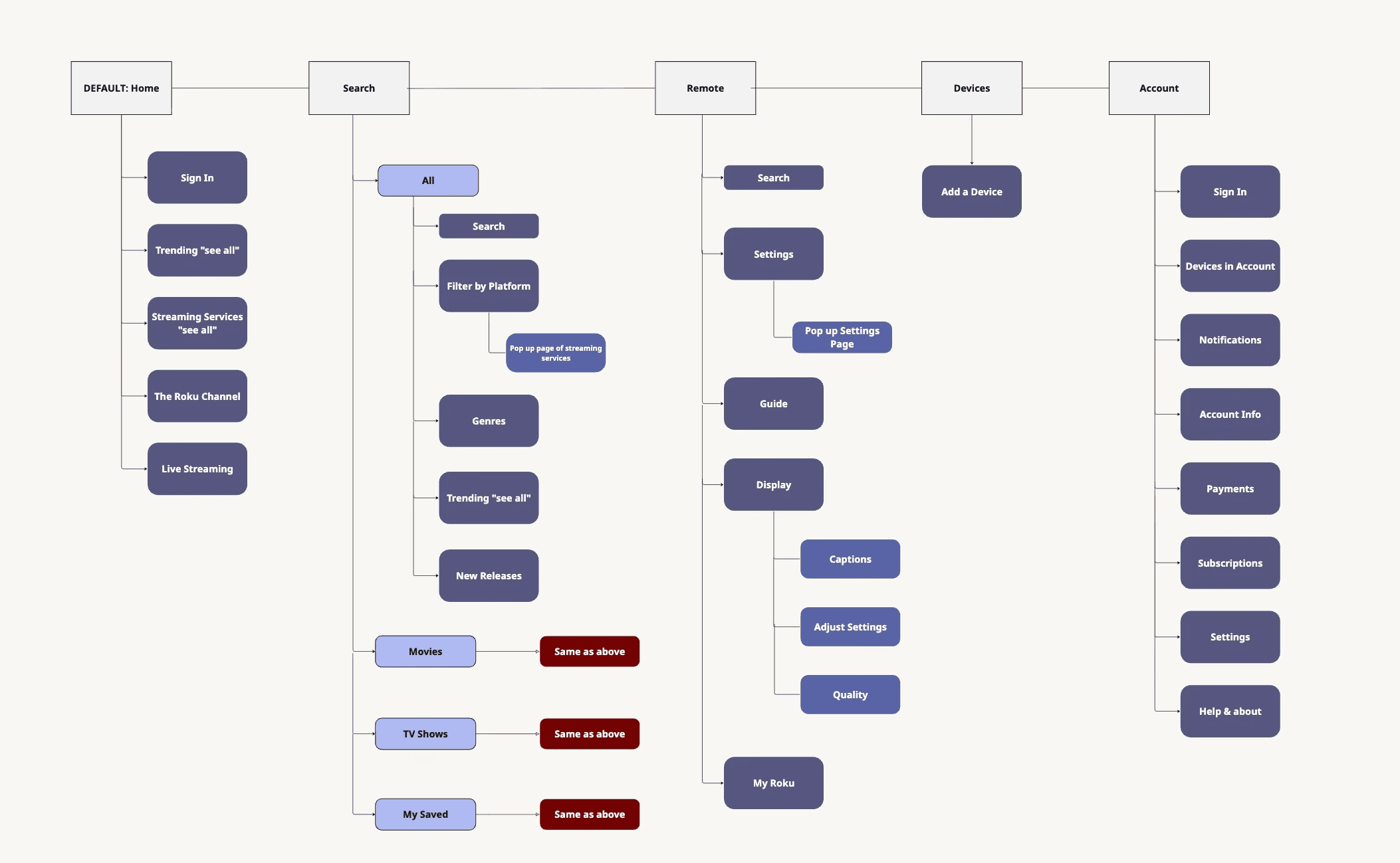
Sitemap
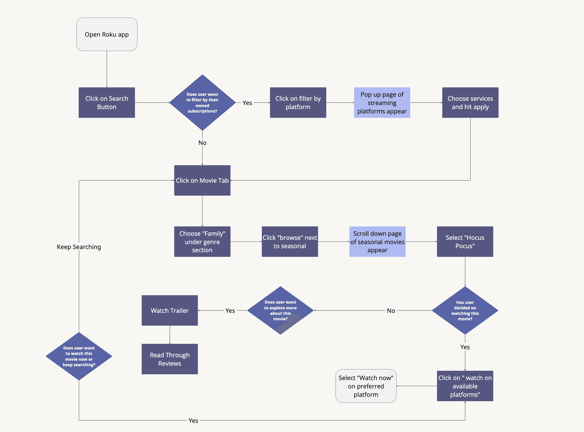
Task Flow - selecting a family movie
Competitors
Amazon Fire Stick
Separation of movies & tv shows
Voice Control strength
Google TV
Customizable but less variety
Key Findings
Content Discoverability
Participants expressed frustration at needing to open multiple streaming apps (Netflix, Hulu, Prime, etc.) to see which platform a movie or show is available on
Decision-Making Support
Users noted that endless horizontal scrolling makes browsing tedious and visually overwhelming, with little distinction between movie and TV content
Remote Usability
Users find the Roku app’s remote layout unintuitive and difficult to use, with buttons that are small, poorly grouped, or inconsistent with their mental model of a physical remote
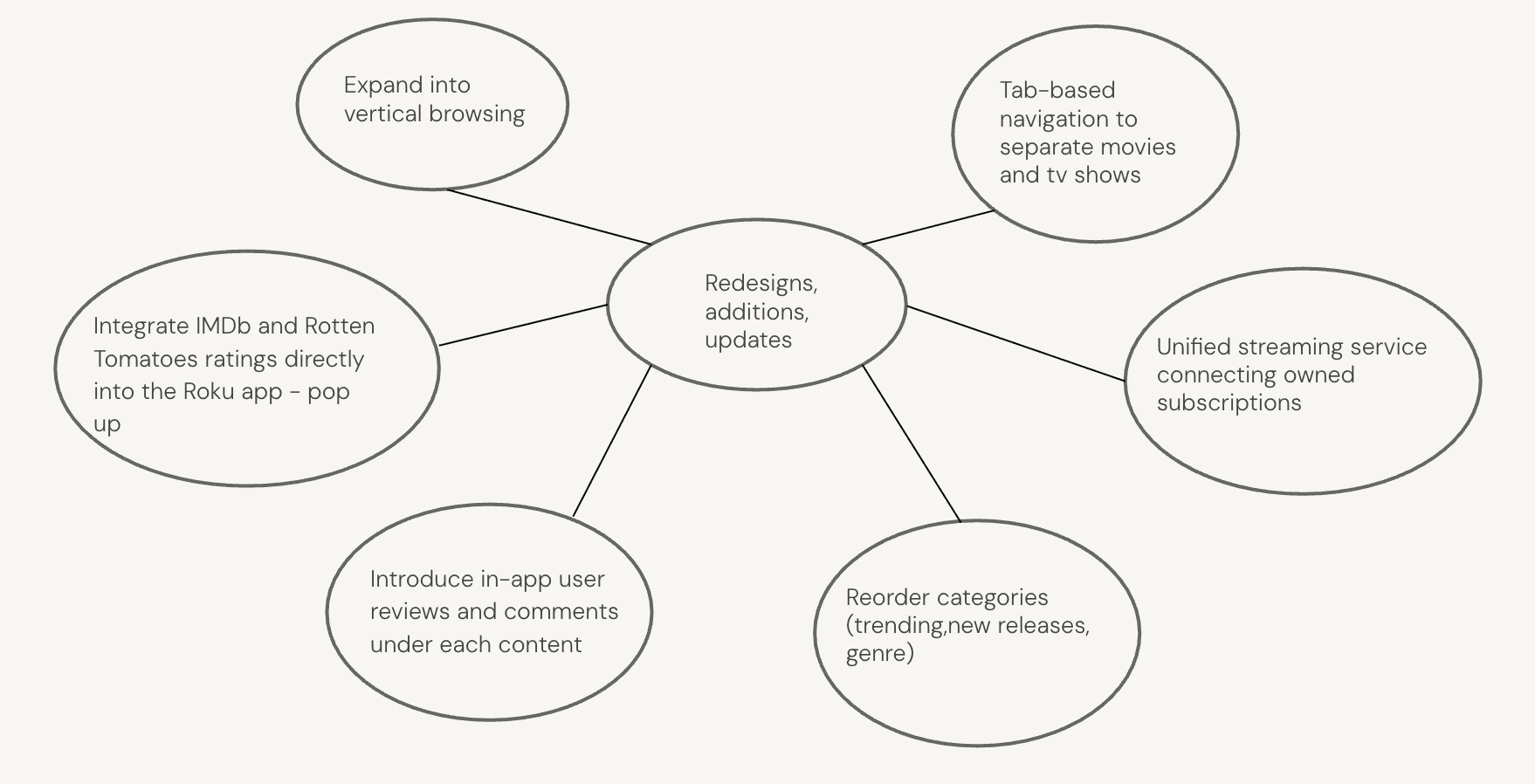
Changes Based on Findings
Home was restructured to surface streaming services at the top and add a "Continue Watching" row, directly addressing users who had to open multiple apps just to find where a show was available
Filtered Search introduced platform filtering, separate Movies and TV Show tabs, and a Recommended section solving the core frustration of users who abandoned Roku entirely to search directly on Netflix or Hulu
Movie Page was redesigned with genre tags, clickable IMDB and Rotten Tomatoes ratings, streaming availability consolidated into one button, and a Similar Movies section giving users the information they needed to choose content confidently without leaving the app
Review/Rating added a sliding detail page with cast info and member reviews, directly responding to users who had watched movies they regretted because the app gave them no way to evaluate content beforehand
Remote was reworked with clearer button grouping and sizing to better match users' mental model of a physical remote, addressing the finding that users found the app's remote unintuitive compared to the original
Feature Additions expanded the app with new functionality surfaced from unmet needs identified during research


